


Hey there, and welcome to our latest feature deep dive—this time shining the spotlight on a nifty view within the SmartSuite platform: the Dashboard view. If you're on the hunt for a way to enhance your data visualization and you happen to be a SmartSuite user (or considering becoming one), you've clicked on the right post. Gareth from Gap Consulting, a pro when it comes to no-code solutions and SmartSuite, has shared a treasure trove of tips and tricks—so stick around!
Understanding the Dashboard View
In the world of SmartSuite, dashboards are king. They're a versatile view that empowers you to distill various widgets—each a powerhouse in its own right—to monitor and analyze your data dynamically. Now, why is this worth your attention? Simply because dashboards are the window to your workflow soul, offering a panoramic view of what matters most in your applications.
Crafting Your First Dashboard
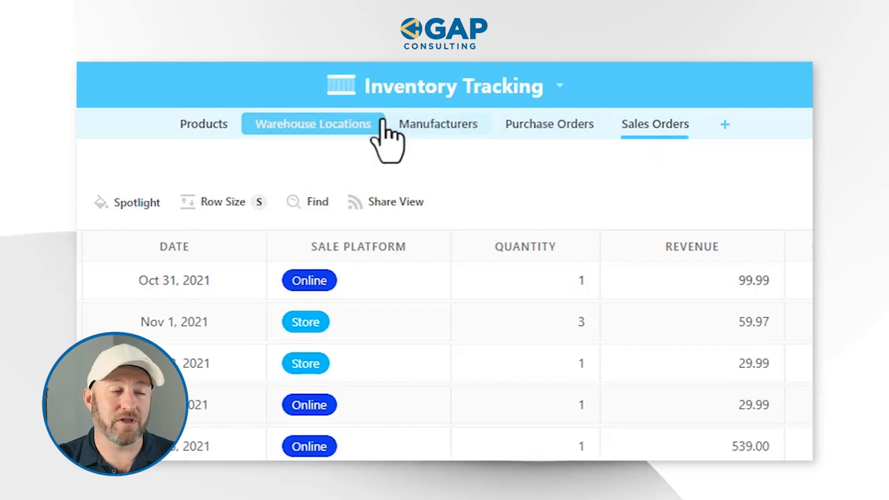
Creating a dashboard is intuitive: start by opening your SmartSuite table and navigate to the views section. From here, creating a new view is a breeze—just look for the teal dashboard icon and let's get started!

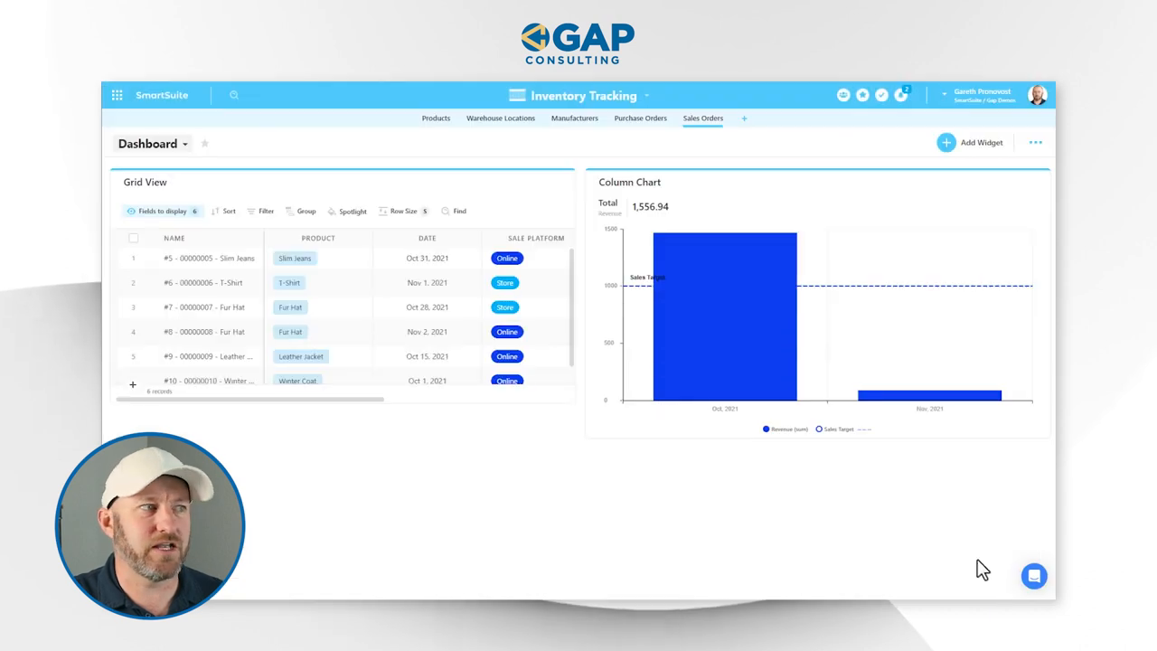
Once your dashboard is up, hit the "Add Widget" button and prepare to be greeted by a smorgasbord of widget options. Everything from metrics to design elements is at your disposal, ready to be tailored to fit your unique data needs.
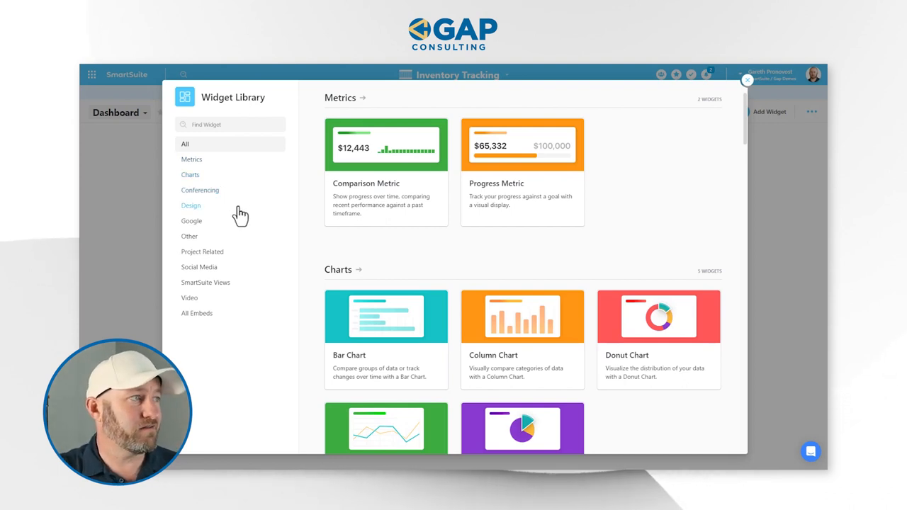
For this walkthrough, let's insert a column chart widget and see how it unfolds:
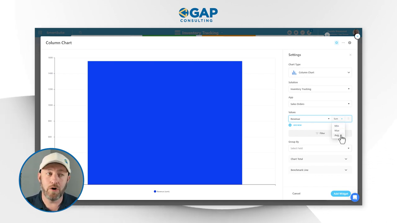
- Choose the chart type—column, stacked area, or other varieties—for visual appeal.
- Select the solution and table for data sourcing.
- Drill down to the values—do you want the sum, average, or maybe just a count?
Don’t forget about filters! You can refine your widget's data feed to exclude or include records based on conditions such as dates or quantities.

Fine-Tuning Your Dashboard
Next, it's time to give meaning to the numbers. Consider grouping data into time periods—daily, weekly, monthly—for a structured timeline of your workflow's pulse. Add a total or benchmark line to set goals and measure performance against them.
Gareth demonstrates how easy it is to resize and rearrange widgets, making sure your dashboard is just as fluid as the data it represents. Keep in mind, permissions are respected here just as they are elsewhere in SmartSuite, so rest assured that sensitive data remains confidential.
Advanced Dashboard Features
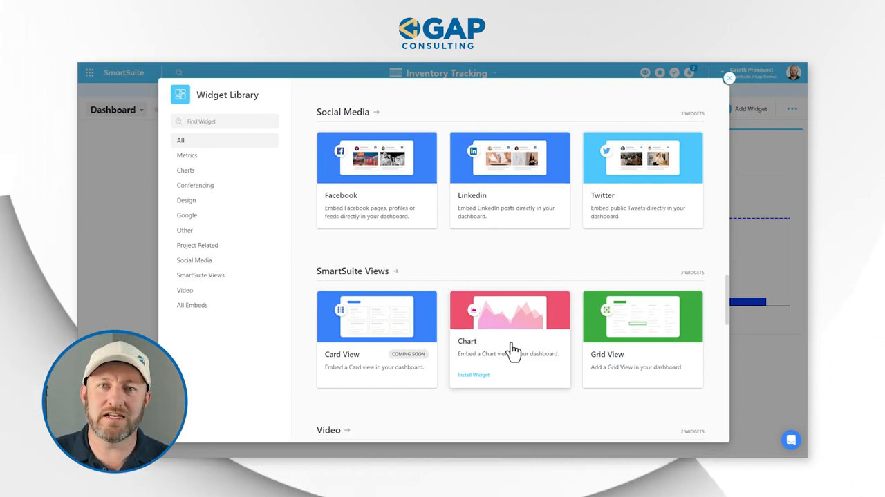
Remember, your dashboard can host a multitude of information sources—conference tools like Google Meet, design elements from Figma, and documents from the Google suite are all fair game. This flexibility ensures all your crucial data and tools can be accessed from one centralized hub.
But there's more—you can embed views within views! Opt for a grid view of an app in your dashboard for a miniaturized, yet interactive, representation of your data. This powerful feature enables you to edit records directly from the dashboard, keeping everything updated in real-time.
Your Dashboard in Action
Imagine this scenario: you record a new sale, and with a few clicks and keystrokes, you've not only cataloged the transaction but also simultaneously refreshed the dashboard to reflect this new data. The immediacy with which the graph charts your updated revenue—for past or present—is almost magical, don—look, your figures have shifted right before your eyes!
In Conclusion
Diving into dashboards within SmartSuite can transform the way you interact with your data. It’s interactive, intuitive, and incredibly insightful. Gareth's video is just scratching the surface, and you're encouraged to experiment and mold your dashboard to fit your business narrative.
If you haven't already taken the plunge, start your adventure with SmartSuite by initiating a free trial. Unleash the full potential of dashboards and let your data tell the story you need to hear.


.jpg)


